A split and tab layout for Vue 3, with a small, explicit boundary: the library arranges views; your application decides what they mean. Nest layouts in tabs, group panes without changing the picture, and keep stateful content alive while the workspace moves around it.
Four real iframe views. Keyboard, mouse, and touch. No installation required.
The 30-second pitch
Give the controller a reactive list of view ids, pane minima, and a storage identity. Render your content through slots. Users can split to any side, move a view into a tab bar, or put a whole arrangement behind a layout tab. The controller preserves that intent independently of the space available. Narrow containers collapse the presentation, not the saved tree.
Unlike an application shell, @0k/vue-split-tabs does not own routes, documents, fetching, titles, or a visual theme. You supply every visible label and choose which host views are closable. New layout commands create placeholders, not invented application documents.
For iframe applications, overlay Keep content stays in one DOM location. The layout changes its position instead of reparenting it, avoiding iframe reloads on moves, zoom, and restore. See Iframes & Keep for the cooperating input helper and origin policy.
Install and render a workspace
npm install @0k/vue-split-tabsVue ^3.5.3 is an external peer dependency. The package is ESM-only; import the stylesheet explicitly and give the root a definite height. The example below uses ordinary Vue content; it needs no iframe helper.
Published component types work with TypeScript moduleResolution: "bundler" and moduleResolution: "NodeNext"; both supported and tested with strict consumer probes. The declaration build qualifies Vue SFC references with .vue.js so both resolvers find the emitted .vue.d.ts files. The controller prop is read once on mount. When replacing the controller, remount SplitTabs with a changing :key="controllerKey" alongside :controller="controller".
<script setup lang="ts">
import { onBeforeUnmount, ref } from 'vue';
import {
  createSplitTabsController, SplitTabs,
  SplitTabsAnchor, SplitTabsKeep,
} from '@0k/vue-split-tabs';
import '@0k/vue-split-tabs/style.css';

const tabs = ref(['editor', 'preview']);
const controller = createSplitTabsController({
  tabs,
  entryKey: 'example',
  storageKey: 'example.layouts',
  minPaneWidth: 180,
  minPaneHeight: 120,
});
onBeforeUnmount(() => controller.dispose());
</script>

<template>
  <div style="height: 70vh">
    <SplitTabs :controller="controller" :labels="{ divider: 'Resize panes' }">
      <template #pane>
        <SplitTabsAnchor part="body" />
      </template>
      <template #keep>
        <SplitTabsKeep v-for="id in tabs" :key="id" :tab="id" part="body">
          <div>{{ id }}: your application content</div>
        </SplitTabsKeep>
      </template>
    </SplitTabs>
  </div>
</template>
Both views initially share one tab set. Drag a tab toward a pane edge to split it out. A split command instead returns a fresh placeholder in its success result. Register a real id in tabs before calling controller.replace(result.view, id). Render a host-owned empty state for placeholders if users can leave them unfilled. The library renders the bar beside the pane, never inside host content. Customize labels with root #tab and add controls with #bar-end; use alwaysShow when those controls must stay available on a one-tab set.
Watch the layout vocabulary in motion
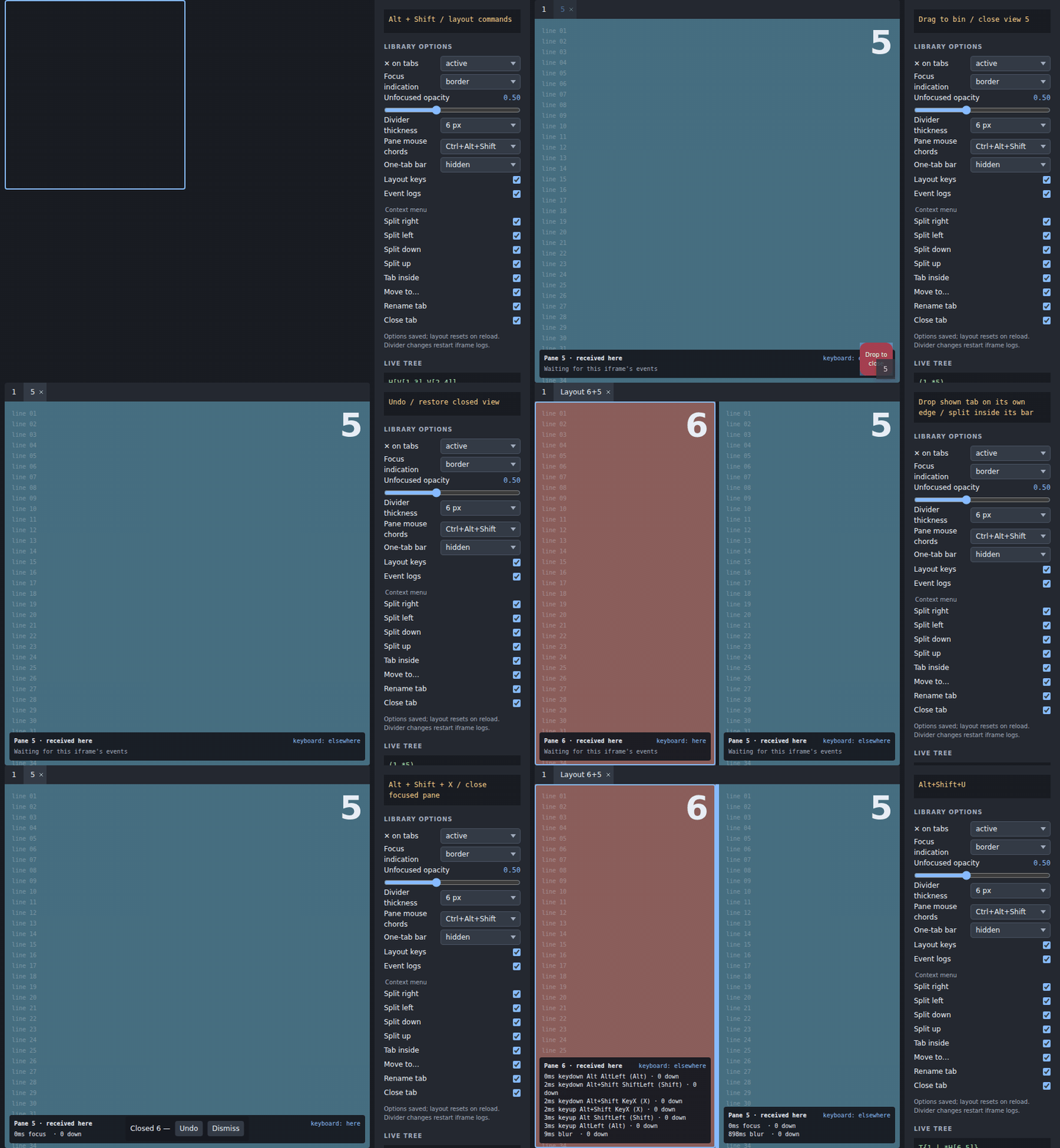
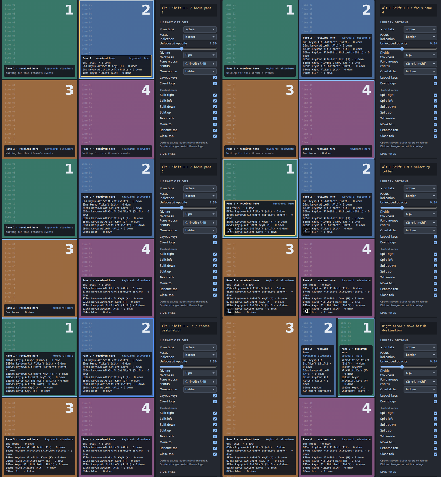
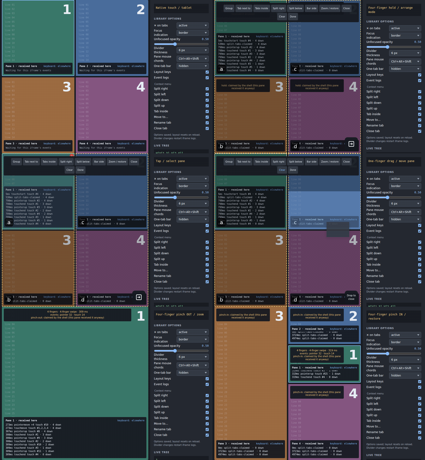
These clips are the repository's captured Workbench scenarios, not separate implementations. The keycast shows the chord or gesture being demonstrated. The Workbench defaults its pane mouse chords to Ctrl+Alt+Shift; the library defaults to Alt+Shift. Its options panel can switch between those policies.
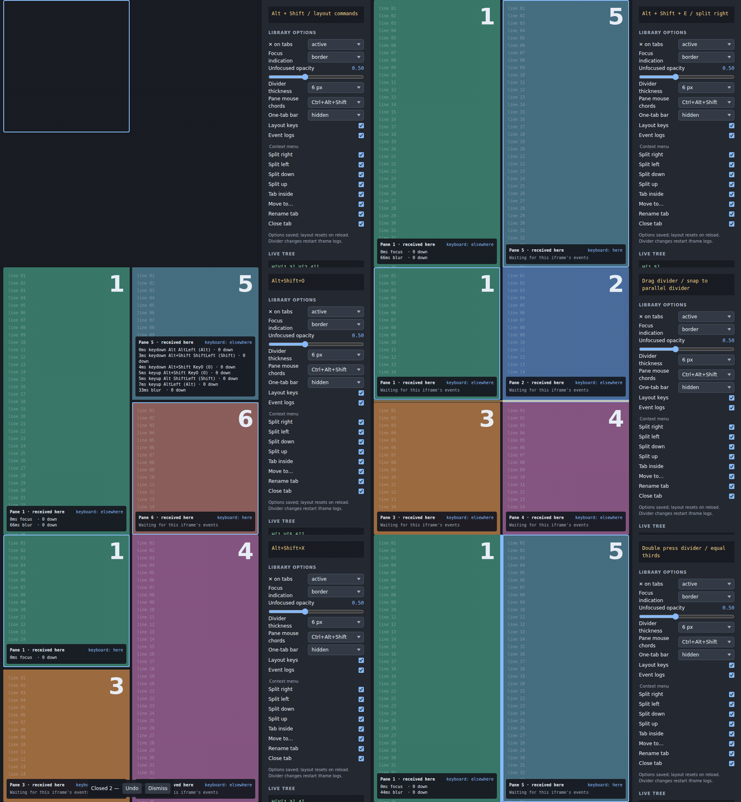
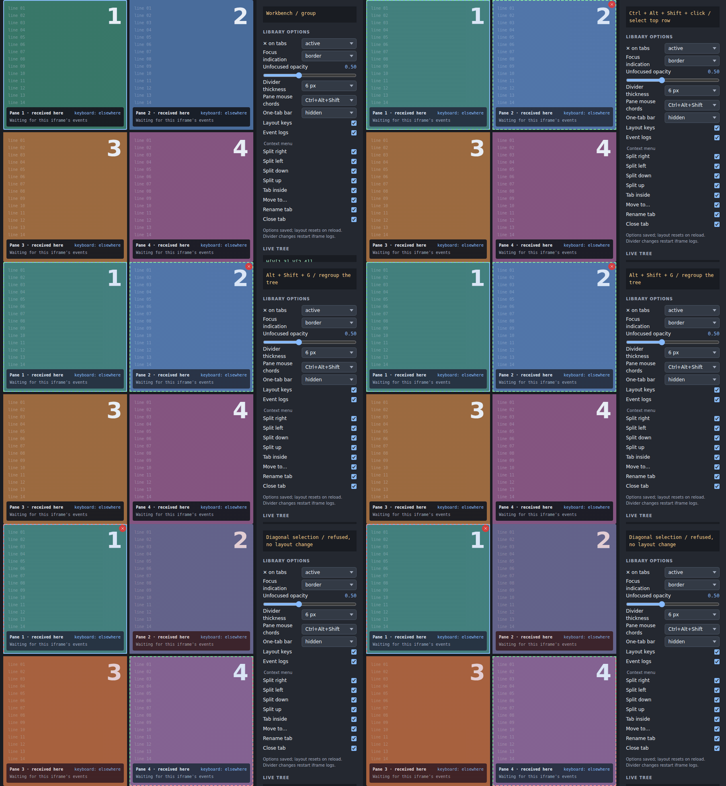
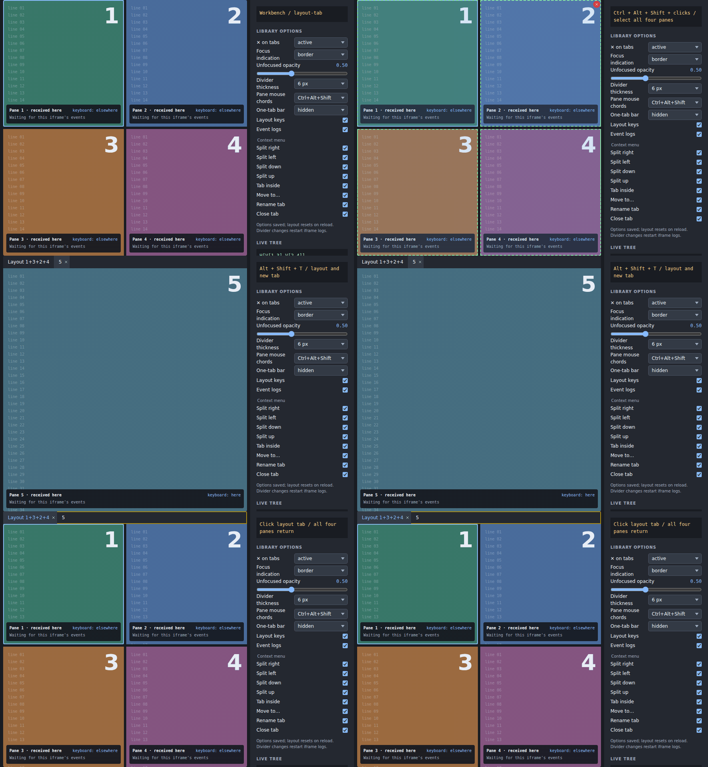



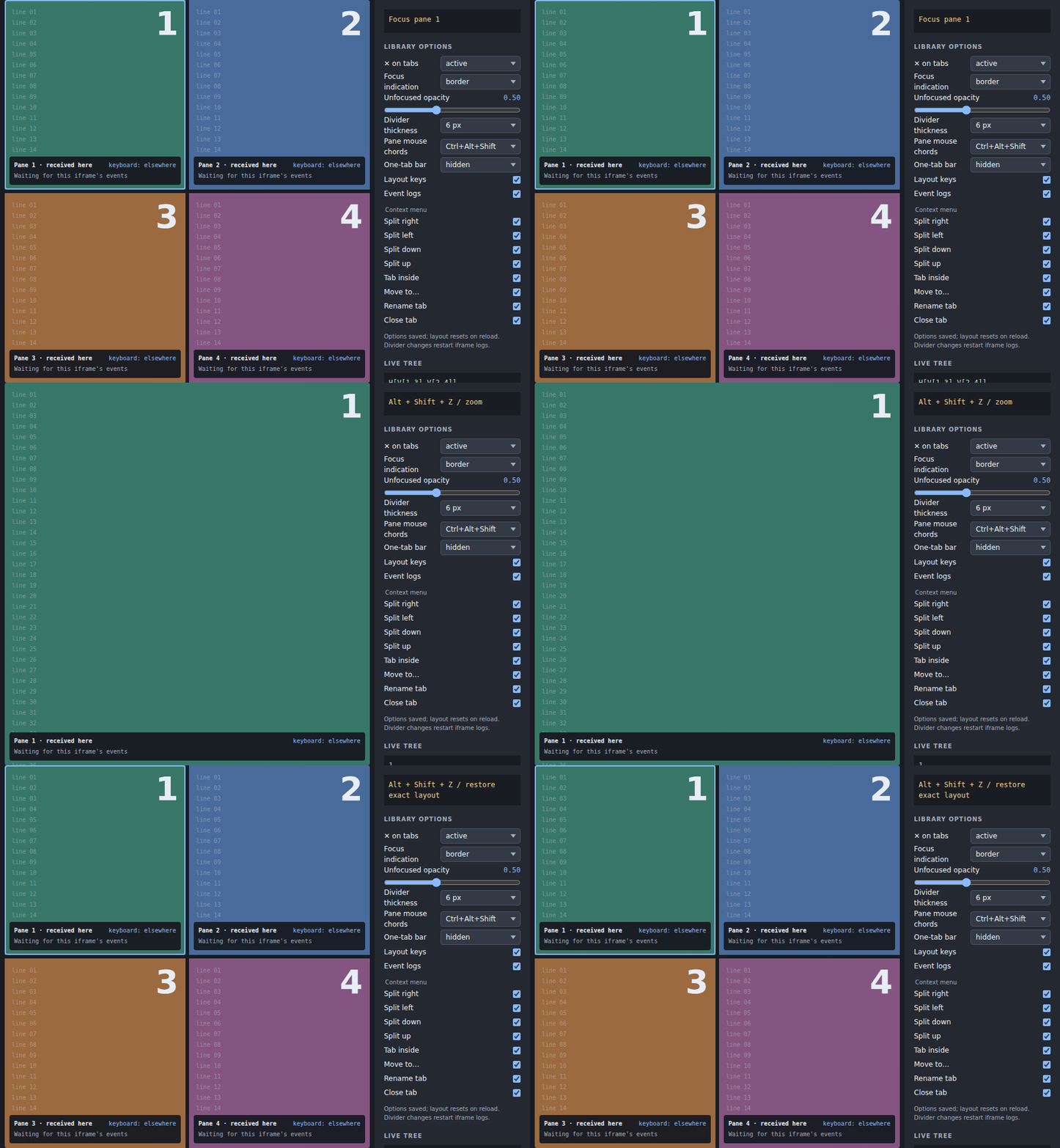
Explore before integrating
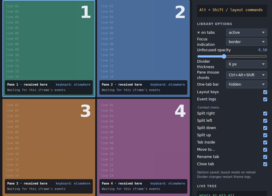
The Workbench starts at H[V[1 3] V[2 4]] on each reload. All numbered views are closable. Library options persist locally, but the layout uses in-memory storage. Changing divider thickness recreates the controller and iframes while keeping the layout; their local event logs restart.
Read Concepts & notation to understand what the tree represents, then use Interaction as the keyboard and gesture field reference. For an existing 0.2 integration, start with Migration to 0.3.